
Whether watching a movie in the theater or on a smaller screen someplace else, there’s nothing better than the feeling of knowing the film’s about to start. When you see that familiar logo fade in and hear its iconic music begin to play, you just know—it’s time. Many logo scenes are brave and bold, like Metro-Goldwyn-Mayer’s roaring lion, or grand and triumphant, like 20th Century Fox and Universal Studios. You may remember THX’s signature crescendo like a nightmarish doom and look back with fondness on Disney’s captivating soar toward Cinderella’s castle. But for me, there’s no opening that captures the inviting imagination and nostalgia quite like the DreamWorks logo.
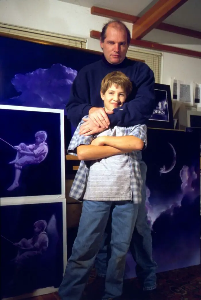
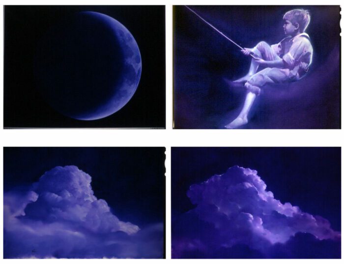
American artist Robert Hunt is credited for those huge, fluffy, white clouds that cover the sky as the camera pans up to a little boy—his little boy—sitting on the crescent moon. With a fishing pole in hand, he casts a line, hoping for a bite as the movie begins to play. But how did he get up there?
Perhaps, he couldn’t let go of his handful of balloons, as we’ve seen him float up, up and away before countless DreamWorks films. But the more interesting question is how did he come to be?
When Jeffrey Katzenberg, former CEO of The Walt Disney Company, left the organization in 1994 to found DreamWorks Pictures with Stephen Spielberg and David Geffen, they needed an image for their new logo. Spielberg envisioned something timeless and reminiscent of Hollywood’s Golden Age, so he turned to his collaborators at Industrial Light & Magic, who led them right to Hunt.
How did the opportunity of working with DreamWorks present itself?
I live in Marin County, California, which is right where Industrial Light & Magic (ILM) was located, so I knew a lot of people that worked there—Clint Goldman, Dennis Muren and Dave Carson. They contacted me because they had been working on this logotype with Steven Spielberg for DreamWorks. But they had kind of come to some sort of impasse where Steven wasn’t particularly satisfied with the work that had been done.
They were trying to do a CGI (computer-generated imagery) cloudscape—and this was in the pretty early days of CGI stuff. I think this project started just a couple of years after Jurassic Park, so it really wasn’t quite working for what was in Spielberg’s mind.
Unbeknownst to me, there had been a lot of other people and entities working on this logo before I ever got involved, but Dennis Murren, the senior visual effect supervisor, asked me if I could paint a cloudscape to show Steven what it could look like as a traditional handpainted image.
Clint Goldman, the producer, called me the day before they needed it and just said the painting had to be small enough that they could carry it on a plane…which was a challenge.
That certainly is a quick turnaround. Did they give you any examples to work from?
ILM is only five, ten minutes away, so they messengered over a package with a few screengrabs of what they’d been doing and a couple of other timecodes that were basically what they didn’t want. I just kind of made up a cloudscape which pretty much is exactly what the end of the trailer looks like now, but without the boy. So I painted a little 10×14 version or something like that size.
I think in one of the screengrabs, you could see that they had an idea of the “D” in DreamWorks turning into a crescent moon…it wasn’t really part of what I was supposed to do, but I also just drew a little doodle of a man on the moon. Then, I had my son, William, come out to the studio and sit on a little trash can, and I just did this drawing.
One of ILM’s screengrabs did have a figure on the moon, but it was completely different. It was just kind of an ethereal, blurry little figure, so I made this other thing, drew it and brought it down to ILM the next morning because they were going to fly it to Los Angeles.
Later that day, I was gone for a few hours doing some errands, and I came back and just had a ton of phone messages.
That’s usually a sign that something went very well or terribly wrong. Which was it?
What had happened was Spielberg had really liked it. Like he really, really liked the clouds.
Many of Hollywood’s more ethereal-looking logos really have a way of using clouds around another image—Columbia Pictures and the Torch Lady, Paramount and the Majestic Mountain, TriStar Pictures and its Pegasus. What about your boy on the moon?
Somebody there said, “We probably won’t show this to him because it’s not really what we’re looking for, but we’ll bring it anyway, just as backup.” But because Steven was so positive about the end frame, they showed the logo drawing to him, and he liked that too. Pretty much the message that I got was Steven had said, “This is what I want, and whoever did this is who I want to do it.”
Wow, I bet that was amazing to hear!
Yeah! And I had worked for Spielberg before on posters and things. I’m not really sure whether there was any name recognition or anything in that. I doubt there was. I think he just saw it and really liked it. And because he’s Spielberg, you know, this was it. That was what the animation was gonna be. I just had to figure out a way to do it with the people at ILM. The catch, of course, was that it would be done by hand and not CGI.
The original storyboards that were used for versions before I was involved were done by a company called Kaleidoscope Films. I worked with Dave Carson, the director, to figure out the general layout and process of the way the elements moved over each other.
Over the course of the project, I attended dailies at ILM and a number of video conferences with Steven Spielberg—who was a dream to work for. As far as the process went, these were completely analog oil paintings, done on the scale of traditional matte paintings but painted on gatorboard as opposed to glass. I photographed the paintings, the transparencies were scanned and composited in a sort of overlapping animation at ILM, kind of like a multiplane Disney camera.
I still have the original 18 paintings—in fact, one of them was just in a retrospective show of my work at the Society of Illustrators in New York. ILM also added the fishing bobber and pond ripples. And then the music was by John Williams.
Doing something that had this sort of old-time movie studio thing was really the challenge. Spielberg really wanted something like a Miss Columbia or the MGM lion, something that would last a long time and wouldn’t have to be changed. You know, the MGM lion actually had been changed many times, but they always came back to the original because it can’t be beat.
That’s true, and what a great story! I would say the DreamWorks logo is still a timeless opening, and even more so once it was paired with Harry Gregson-Williams’ “Fairytale” theme from Shrek for the DreamWorks Animation movies.
Speaking of DreamWorks Animation, their theatrical opening did change quite a bit back in November. When Puss in Boots: The Last Wish came out, DreamWorks Animation revealed a reimagined “Moon Child.” What was your reaction?
When I read your email to me, I was thinking about it, and the thing is…I hadn’t seen it, and I didn’t watch it until today.
I knew that it was a big departure because a lot of people contacted me and asked me what I thought about it, and I didn’t really want to see it. To tell you the truth, I try to avoid things that make me unproductive. I kind of felt like if I didn’t like it, or if I got frustrated by it, or just somehow got in my head that it was a messed up thing, then I would be having to cope with that. So I just didn’t look at it. But I did look at it today.
And what did you think?
I think it’s okay. I would have probably done it in a different way, but that’s not the point. My main reaction to the whole thing is that it’s a good job for what they’re trying to achieve.
For the long run, I think they’ll have to keep updating it if they keep it, but it seems like they were looking at the Marvel thing. They have a comic-based studio and can have that sort of flipping book idea. Whereas DreamWorks made a different, Peter Pan kind of thing.
But I think for what they were trying to do, they did a good job. It’s not really a job that I was even ever involved in because my thing was really designed to be the identity of the studio right out of the gate. I would be a little sad if this replaced the entire logo, but it’s a different thing, and I think taking it as a different thing is okay.
How would you have done it differently?
Well, I don’t know because I haven’t really thought about it. But I think it would have been interesting to try and find a way to use the characters from the DreamWorks films, like Shrek and so forth, in a way without having to have the DreamWorks boy high-fiving them along the way, and just have the scene somehow lead to him in the end.
I think the original iconic logo—that’s the thing people will remember. And they did do that in a sense. I just have a vested interest, I suppose, in that I like the old logo. But I think the old logo was a good solution for the studio at that time. And this new logo is a good solution for the studio now.
Looking back on that experience, what do you most appreciate about it?
I was very glad to have had a chance to do it. I was just fortunate that I happened to be in the right place at the right time and with the right skills. ILM wanted something analog, and this was a time when lots of the analog people in the film industry weren’t really available. A lot of matte painters and people like that moved into other positions or were doing other things, and so I just happened to have the right set of skills for the kind of thing that they wanted. I was very lucky.
And what about your son, William? What’s he up to now?
You know, I didn’t really even tell people he was the boy on the moon except for the people that were involved in the making of it. And I never really did any interviews about it for a long time because he was a kid. But now, it’s pretty well known that he was the model.
He’s actually in the film industry himself now, composing music for movie trailers—and he’s quite successful. He’s much more involved than I am—I’m like a tourist in the film business!
But, you know, he doesn’t make a thing out of it or anything. He doesn’t want the fact that he’s the DreamWorks boy to be a part of his career, and I totally understand and respect that.


Wow,so william is still alive? Hmm very strange.
Amazing interview!!!!
This is an awesome interview! I love that Dreamworks Logo. Thanks for sharing this interview.
EXCELLENT interview!!